The curatorial and editorial project for systems, non-
Inverse | Coleman Projects | February 21 -
Katrina Blannin
A review by Laurence Noga
©Copyright Patrick Morrissey and Clive Hancock All rights reserved.
In her current show ‘Inverse’ at Coleman Projects, Katrina Blannin constructs a highly experimental set of relationships between her recent monotypes, paintings and animation. Letting the geometry and movement develop unexpected material clashes, she allows scale and proportion to generate her stylish compositions.
Blannin positions her works in pairs or groups. Everything feels precisely defined,
using optically chromatic juxtapositions to create movement in space. Tonal variation
often brings new perspectives, building a crescendo of harmony and disharmony, not
only through her flawless technique, but the way it is questioned through the glitches
or mis-
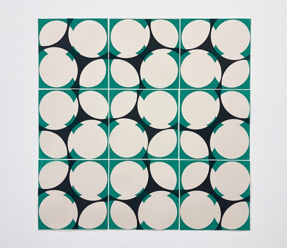
A recent monotype, Domenica #26 (above), is developed through a sophisticated grid
structure, comprising nine sections that are spatially taut. This is achieved through
the layering and ingredients of disruption that underpin Blannin’s systematic approach.
The variation in the structural elements build an inherent complexity through the
scale and ratio, with each section offset by a creamy white ground. Blannin uses
a clover shape or quatrefoil form, repeating the pattern within each frame. This
allows the Gothic style and flatness (reminiscent of 1950s lampshade green) to create
a tension between a sense of place and a pre-
Domenica #26 (2025), 9x30cm, monotype: ink: Fabriano Rosaspina Ivoire

Mockette #29 (2026), 55cm x 55cm, acrylic on linen
At first glance Mockette #29 blows up a part of the section from the print beside
it. But there are some important elements here that we can’t ignore: the proportions
and the system of proportions. Blannin gets us thinking about each of the works’
spatial depth, and the positioning of space and colour within them, suggesting a
more logical structure and chromatic harmony within the painting. The lightened shade
of Phalo Green and the sharpened tone of Mars Black keep us linked (in our mind’s
eye) to the scale and ratio in both works, in terms of the amount of surface area
exposed in the compositions. I am intrigued by the hard-
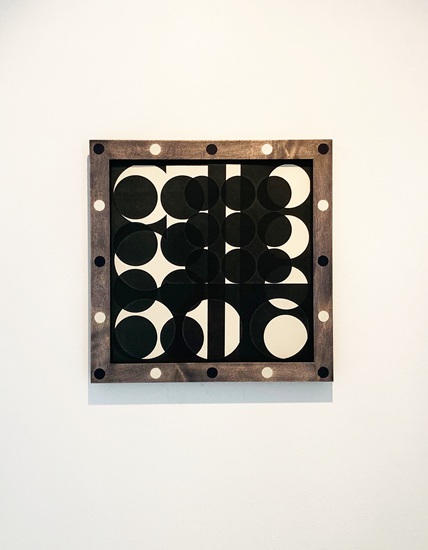
Mockette #1 (2025-
Mockette #1 alters our perception through a number of points within the composition.
A clever scaffold of tonal jumps in the different use of blacks develops illusory
elements, like a combination of rhythms and harmonies. Nine smaller-
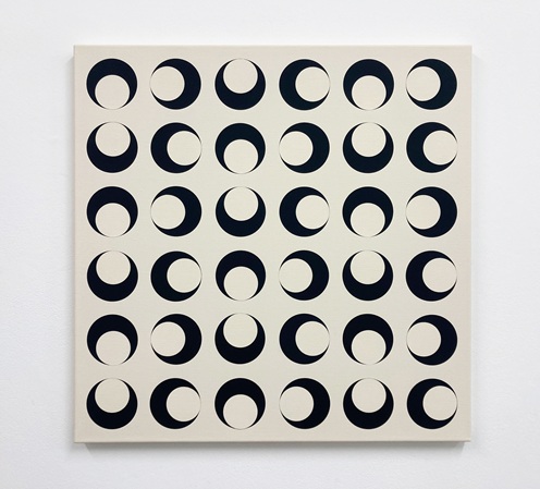
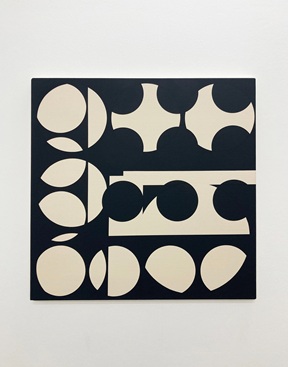
Mockette #26 (2026), 70cm x 70cm, acrylic on linen
Simplifying the compositional elements focuses our attention in Mockette #26.This
work supports the rest of the exhibition, humming through a grid of repeated geometric
forms with what feels like a low-
Mockette #27 (2026), 55cm x 55cm, acrylic on linen
Mockette #28 (2026), 55cm x 55cm, acrylic on linen
Two paired paintings (Mockette #27 and #28) invoke a sense of unease that Blannin
develops between the works. Initially, the paintings have a kind of stillness, but
as you start to register what is concealed or disrupted, a more animated appearance
is suggested. I am reminded of the early Pac-


Mockette #1, 2026, animation Kevin Rowe(kevinrowepaintings.com), music Pete Wilson (petewilsonlizard@gmail.com)
Mockette #25:abcd, 2025, 4x30cm, monotype: ink/Fabriano Rosaspina Ivoire
Mockette #1, an animation directed by Kevin Rowe (music by Pete Wilson) lets the
shapes float, like cut-
Perhaps taking as its cue the composition and layering decisions in Mockette #25 abcd. The pointer dots ebb and flow, overlapping and receding, bringing a flavour of the jazz scene in the 1960s and ’70s. Blannin talks about her influences, including Verena Loewensberg, and her approach to a grid system combined with a rational organising principle, which allows her painting to grow not only from a concrete perspective, but also from the background of jazz influences and record collecting in the discount record shops of Zurich. Somehow, the animation operates like a secret message as the scale and structure converges. Flashes of colour such as light violet, ultramarine blue, or light green break into the monochrome palette, altering our perception between the overlaid structural components and Blannin’s code, which we can’t quite break.
Laurence Noga 2026